Data Visualization: Best Tools, Templates, and Examples + How to Visualize Data (2026 Guide)
Franklin

Introduction
Whether you are trying to analyze a sudden spike in customer churn, present quarterly financial forecasts to stakeholders, or track daily sales metrics, how you visualize your data determines how well your insights are understood.
In this comprehensive guide, we will explore everything you need to know about data visualization in 2026. We will break down what it is, why it matters, review the best data visualization tools on the market, provide real-world examples and templates, and show you step-by-step how to transform raw datasets into compelling visual stories.
What Is Data Visualization?
Direct Answer: Data visualization is the graphical representation of information and data. By using visual elements like charts, graphs, and maps, data visualization tools provide an accessible way to see and understand trends, outliers, and patterns in data.
In the context of modern business intelligence, data visualization is more than just drawing a chart. It is the critical bridge between raw database metrics and human cognition. By transforming complex, multi-dimensional information into highly readable, interactive, and actionable visual formats, it allows teams to communicate findings, validate hypotheses, and make data-driven decisions with confidence.
Why Data Visualization Matters
Understanding the strategic importance of data visualization is essential for modern teams. Here is why it remains a critical business capability:
Accelerates Data Comprehension: The human brain processes visual information significantly faster than text or spreadsheets. Dashboards allow stakeholders to grasp complex business realities in seconds.
Identifies Trends and Anomalies: Visual encoding makes it immediately obvious when a metric suddenly drops or a new market trend emerges, which might go unnoticed in a sea of tabular rows.
Empowers Cross-Functional Communication: Data visualization serves as a universal language that bridges the gap between technical data teams and non-technical business units (like Marketing, Sales, or HR).
Enhances Reporting and Presentation: High-quality visualizations build credibility. When presenting to a board of directors or clients, clear visual data storytelling is far more persuasive than abstract numbers.
Drives Actionable Decision-Making: By transforming data into clear insights, organizations can move from "what happened?" to "what should we do next?" efficiently.
Quick List: Top 5 Data Visualization Tools
If you are looking for the absolute best software solutions in 2026, here is our curated list of the top contenders:
Powerdrill Bloom – Best for AI-powered insight extraction, fast chart generation, and seamless presentation output for non-technical users.
Tableau – Best for deep, complex visual exploration and enterprise-scale data analysis.
Microsoft Power BI – Best for organizations heavily invested in the Microsoft ecosystem and enterprise corporate reporting.
Looker Studio – Best for marketing teams needing a free, cloud-native tool with seamless Google integration.
Metabase – Best for engineering and product teams looking for an open-source, fast SQL-to-chart dashboarding tool.
Quick Comparison Table
Tool | Best For | Key Features | Pricing |
AI workflow, non-technical users, presentation output | Natural language query, auto-charting, smart reporting | Freemium; Paid plans start at $13.27/mo | |
Deep visual analytics, enterprise data exploration | Drag-and-drop viz, massive data handling, VizQL | ||
Microsoft ecosystem integration, corporate BI | DAX formulas, strong data modeling, Excel integration | ||
Marketing dashboards, free cloud reporting | Native Google connectors, template gallery, sharing | Free | |
Startups, product metrics, SQL users | Simple UI, custom SQL queries, embedding | Open-source Free; Cloud starts at $100/mo+$6/uesr/mo |
How Data Visualization Works
To truly leverage business data visualization, it helps to understand the underlying workflow. Here is the modern lifecycle of data visualization:
Data Collection and Preparation
The process begins by gathering raw data from various sources—CRMs, marketing platforms, financial software, or flat CSV files. This step involves connecting these distinct data silos into a central repository or importing them into your visualization tool.
Data Cleaning and Structuring
Raw data is rarely ready for immediate analysis. It must be cleaned (removing duplicates, handling missing values) and structured (formatting dates, standardizing categories) so that the visualization engine can accurately interpret the metrics and dimensions.
Chart Selection and Visual Encoding
This is the core of visualization. Depending on the goal, you select the right chart type: line charts for trends, bar charts for comparisons, or scatter plots for correlations. Visual encoding involves mapping data variables to visual properties like color, size, and shape to make the insight pop.
Insight Communication and Storytelling
A chart alone is just an image. Real value is created when you wrap those charts into a cohesive narrative. This involves adding context, annotations, and structuring multiple visualizations to guide the viewer through a logical business story.
Reporting, Dashboards, and Presentation Output
The final step is distribution. Insights must reach decision-makers. This takes the form of interactive live dashboards for daily monitoring, automated PDF reports for weekly updates, or visually polished presentation slides for executive meetings.
Top 5 Data Visualization Tools: In-Depth Reviews
Here is a closer look at the market leaders, evaluating them on their capabilities, user experience, and overall value.
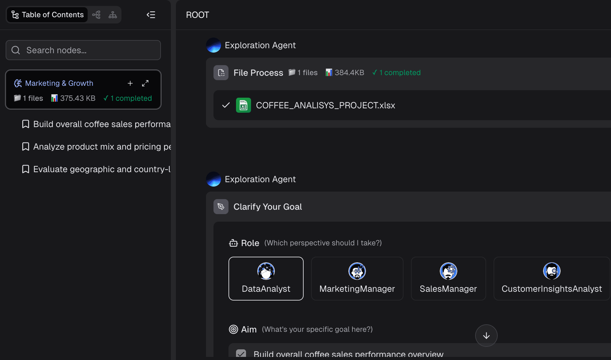
1. Powerdrill Bloom
One-sentence intro: An innovative, AI-native data analysis and visualization platform designed to help users quickly transition from raw data to actionable insights, charts, and polished presentation outputs.
Key Features: Natural language data querying, automated chart generation, AI-driven insight summarization, one-click export to presentations and reports.
Pros: Extremely low learning curve; completely eliminates the need for SQL or complex formulas for standard analysis; bridges the gap between data exploration and final business reporting beautifully.
Cons: Not designed for highly complex, multi-layered data engineering tasks that require heavy scripting; customization of highly abstract chart types is somewhat limited compared to developer-focused tools.
Pricing: Generous free tier available; Pro plans start at $13.27/mo per user.
2. Tableau
One-sentence intro: The long-standing powerhouse of the BI industry, offering unparalleled depth in visual exploration and custom chart creation for data professionals.
Key Features: Proprietary VizQL engine, extensive library of complex visualizations, deep interactivity, robust data blending, strong community ecosystem.
Pros: Can visualize virtually anything you can imagine; handles massive datasets smoothly; exceptional for deep-dive exploratory analytics.
Cons: Steep learning curve for non-technical users; high licensing costs; can be overkill for simple reporting needs.
Pricing: Tableau Creator Starts at $15/user/mo (billed annually).
3. Microsoft Power BI
One-sentence intro: A comprehensive business analytics service by Microsoft that provides interactive visualizations and robust data modeling, deeply integrated with Office 365.
Key Features: Strong data preparation capabilities (Power Query), DAX language for advanced calculations, seamless Excel and Teams integration, enterprise-grade security.
Pros: Extremely cost-effective for organizations already using Microsoft infrastructure; incredibly powerful data modeling; massive enterprise adoption ensures extensive support.
Cons: The desktop application can be resource-heavy and clunky; mastering DAX requires significant time and effort; the interface can feel overwhelming to beginners.
Pricing: Power BI Pro starts at $14/user/mo.
4. Looker Studio
One-sentence intro: A free, web-based data visualization tool by Google that makes it easy to create customizable and shareable dashboards, especially for marketing data.
Key Features: Native integration with Google Analytics, Google Ads, and BigQuery; easy link-sharing; pre-built template gallery; highly customizable canvas.
Pros: Completely free to use; incredibly easy to connect to Google ecosystem data; user-friendly drag-and-drop interface similar to Google Slides.
Cons: Performance can lag significantly with complex datasets or too many blended sources; lacks advanced analytical functions and predictive capabilities.
Pricing: 100% Free.
5. Metabase
One-sentence intro: A lightweight, highly accessible open-source BI tool that allows teams to query databases and build dashboards quickly, with or without SQL.
Key Features: Simple question-builder interface, raw SQL mode for developers, easy dashboard embedding, automated pulse reports via Slack or email.
Pros: Setup takes minutes; excellent balance between non-technical usability and developer flexibility; great open-source community.
Cons: Visualization options are relatively basic and rigid; struggles with highly complex, cross-database joins without heavy pre-modeling.
Pricing: Open-source version is free; Cloud starts at $100/mo+$6/uesr/mo.
Common Use Cases for Data Visualization
Data visualization is applied across every department to drive performance. Here are the most impactful business use cases:
Financial Reporting and Forecasting
Finance teams use visualization to replace endless spreadsheets. Dashboards track cash flow, revenue vs. target, expense breakdowns, and burn rates. Visualizing financial data makes it easier for non-financial leaders to understand burn rates, profit margins, and future financial forecasts.
Marketing Campaign Analysis
Marketers rely heavily on dashboards to track campaign ROI, website traffic trends, conversion funnels, and customer acquisition costs (CAC). Visualization helps them see which channels are performing best and quickly reallocate ad spend dynamically.
Sales Performance Tracking
Sales leaders use visualization to monitor pipeline health, win/loss ratios, regional sales distribution, and individual rep performance. A clear visualization of the sales funnel immediately highlights bottlenecks where prospects are dropping off.
Product and User Behavior Analysis
Product teams utilize heatmaps, cohort analysis charts, and user journey flowcharts to understand how users interact with their software. This visual data is crucial for identifying friction points in the UX and guiding the product roadmap.
Executive Dashboards and Board Reporting
C-level executives need high-level overviews without the noise. Executive dashboards aggregate key performance indicators (KPIs) from across the company into a single pane of glass, ensuring leadership can monitor the overall health of the business and report confidently to the board.
How to Create Data Visualizations: Step-by-Step Guide
Creating actionable visual stories doesn't have to be complicated. Using a modern AI data visualization tool like Powerdrill Bloom, here is how you can go from raw data to a finished presentation in minutes:
Step 1: Import Your Data
Start by connecting your data source. You can upload a CSV/Excel file or connect directly to databases and cloud apps. The tool securely ingests your data into its workspace.
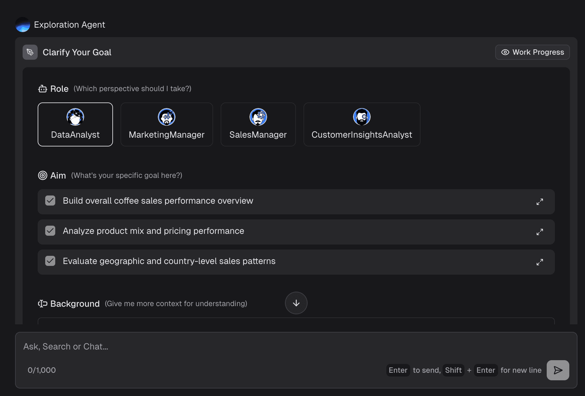
Step 2: Clean and Explore the Dataset
Before charting, ensure the data is accurate. Powerdrill Bloom's AI automatically detects data types (e.g., recognizing dates vs. text) and flags potential anomalies or missing values, allowing you to clean the dataset with a few clicks.
Step 3: Ask Questions in Natural Language
Instead of writing SQL queries or building complex pivot tables, simply type what you want to know. For example: "Show me the monthly revenue growth by region for the last 12 months." The AI translates this intent into data queries instantly.
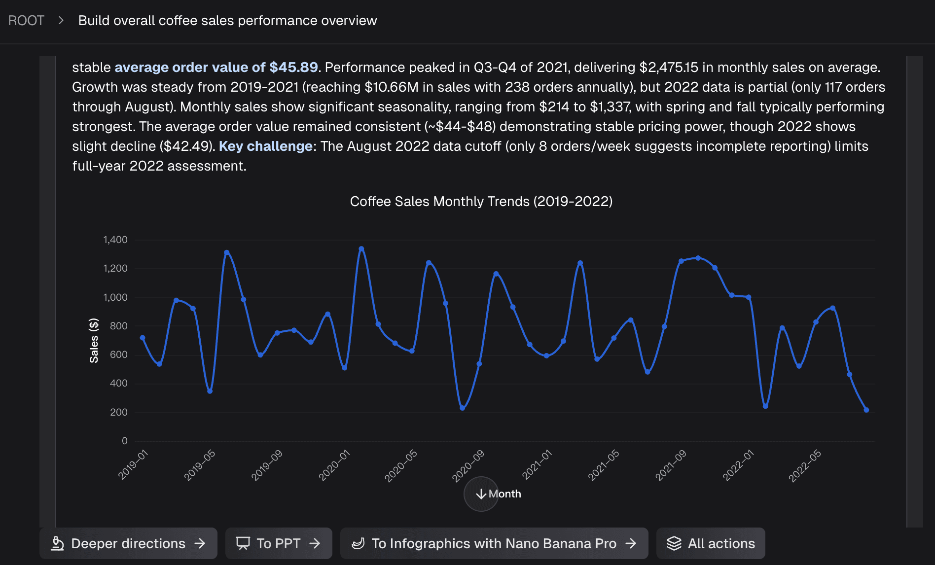
Step 4: Generate Charts and Insights
Based on your query, the platform automatically selects the most appropriate visual format (e.g., a clustered bar chart) and plots the data. Furthermore, it generates a brief text summary of the key insight, saving you the analytical heavy lifting.
Step 5: Export Outputs for Reports and Presentations
Once you have curated your charts, arrange them on a canvas. Powerdrill Bloom allows you to export these views not just as static images, but directly into polished presentation formats or shareable interactive links, ready for your next management meeting.
Templates, Examples, and Free Tools
To avoid starting from scratch, leveraging existing resources is a smart strategy. This section covers key assets to accelerate your workflow.
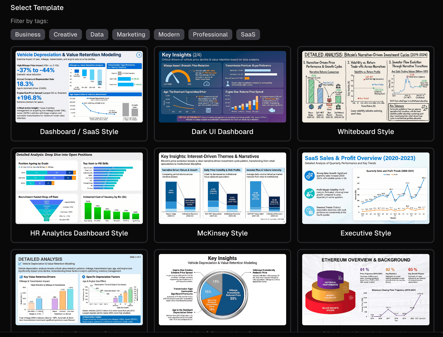
Popular Data Visualization Templates
Using a data visualization template ensures best practices in design and layout. Popular templates include:
SaaS KPI Dashboards: Tracking MRR, Churn, and ARPU.
E-commerce Funnel Templates: Visualizing traffic, cart abandonment, and conversion rates.
Project Management Trackers: Gantt charts and resource allocation overviews.
Tools like Looker Studio and Powerdrill Bloom offer built-in template libraries to help you launch dashboards instantly.
Real Data Visualization Examples
The Interactive Map: The New York Times' election maps are classic data visualization examples, using color gradients to show voting density.
The Cohort Retention Chart: Often used by SaaS companies, this triangle-shaped heatmap shows how long different groups of users stay active over time.
The Sankey Diagram: Used by marketing teams to visualize the exact flow of website visitors from the landing page to the final purchase.
When Free Data Visualization Tools Are Enough
If you are a student, a freelancer, or a small business owner looking at straightforward metrics, free data visualization tools are perfectly adequate. Tools like Looker Studio, the free tier of Powerdrill Bloom, or even Google Sheets' built-in charting capabilities can handle basic CSV uploads and marketing API connections without costing a dime.
When to Upgrade to a More Advanced Platform
You should consider moving to paid, advanced software when:
Your data volume exceeds the limits of free tools (causing lag or crashes).
You need strict data governance, role-based access control, and row-level security.
You require AI-powered analytical capabilities and automated reporting to save team hours.
You need to join complex datasets from multiple different database types.
How to Choose the Best Data Visualization Tool
Selecting the right software depends on your team's technical skills and business needs. Consider these dimensions:
Ease of Use & Non-Technical Fit: If your primary users are business managers or marketers, choose tools with low learning curves. Recommendation: Powerdrill Bloom, Looker Studio.
AI-Powered Analysis & Insight Extraction: If you want software that helps you interpret the data, not just draw it. Recommendation: Powerdrill Bloom.
Chart Quality & Deep Customization: For data analysts who need pixel-perfect control over complex visualizations. Recommendation: Tableau.
Dashboarding & Reporting Output: If your end goal is generating slides or executive reports efficiently. Recommendation: Powerdrill Bloom, Power BI.
Team Collaboration & Governance: For large enterprises needing strict data models and certified datasets. Recommendation: Power BI.
Pricing & Budget: If you need a powerful open-source or highly affordable option. Recommendation: Metabase, Looker Studio.
Conclusion
The era of manual, labor-intensive chart building and static spreadsheet analysis is rapidly being replaced by more intelligent, automated workflows. In 2026, the core value of data visualization isn't just about "making charts"—it is about transforming raw numbers into actionable business insights and communicating them effectively to drive growth.
Choosing a modern solution like Powerdrill Bloom offers a clear advantage, especially for teams who want to bypass steep learning curves and move swiftly from raw data to polished reports, dashboards, and executive presentations.
Ready to transform your raw data into clear insights and persuasive visual presentations? Try Powerdrill Bloom for free today and elevate your reporting workflow.
Frequently Asked Questions
What is data visualization?
Data visualization is the process of translating complex data and metrics into graphical representations, such as charts, graphs, and maps, making it easier for the human brain to understand trends, patterns, and anomalies.
What are the best data visualization tools in 2026?
The top tools include Powerdrill Bloom (best for AI workflows and non-technical users), Tableau (best for deep visual analytics), Microsoft Power BI (best for enterprise corporate BI), Looker Studio (best for marketing), and Metabase (best for simple SQL dashboarding).
Are there any good free data visualization tools?
Yes. Looker Studio is completely free and excellent for marketing data. Metabase offers a powerful free open-source version. Additionally, tools like Powerdrill Bloom offer robust freemium plans perfect for beginners and small teams.
What are some common examples of data visualization?
Common examples include line charts for revenue growth over time, bar charts for comparing regional sales, heatmaps for user behavior on a website, and geographic maps showing customer distribution.
How do I create a data visualization from raw data?
First, import your raw data (like a CSV) into a visualization tool. Second, clean the data to remove errors. Third, select the metrics you want to analyze. Finally, choose the appropriate chart type (or use AI to auto-generate it) and format it into a dashboard or report.
What is the easiest data visualization tool for non-technical users?
Powerdrill Bloom is widely considered one of the easiest tools for non-technical users because it allows you to use natural language (like chatting with AI) to ask data questions, automatically generating the correct charts and insights without requiring SQL or complex formulas.


